








Summer Seminar fellows announced
Twelve graduate students will join this year’s seminar, from programs in the United States, Canada and the United Kingdom.
SMH brand guide · Component library
For developers. The brand guide for everyone else is at /styleguide/.
The technical side of the brand: tokens, every public component on the site drawn live from the real files, and the rules with the tests that check them. Open Show code under any example to copy it. To judge everything together, open the demo page: the header, footer and every component on one page. For the brand in plain words, with downloads, see the brand guide. Component examples use made-up sample content, and their code imports from a page one folder deep, such as src/pages/about/index.astro.
Interim brand. All branding is interim and subject to change before launch day: the logo, the palette, the fonts and the type scale. Build with the tokens, src/data/brand.ts and the Logo component so any of it can change in one place.
Status: Interim brand, set September 29, 2026 and refreshed October 7: the seal in the brand red, a deep navy beside it for structure, cool neutrals (White #F8F9FB, Black #1A1A1C), Barlow Condensed for display and Source Sans 3 for text. A wordmark is to come. All of it is interim and subject to change before launch day. Anything marked Not set is still for the designer to decide: set it in src/data/brand.ts or src/styles/tokens.css and it appears here.
Applies to DIRECTION in src/data/brand.ts: the tone, the sites admired and what to take from them, and what to avoid. Ask before designing anything if it is empty.
Checked automatically. npm test fails if this is broken (src/lib/styleguide/brand.test.ts).
Note: Take the principle from a reference site, never its look. Each design rule below guards against something in the avoid list.
Lives in src/data/brand.ts
---
import { DIRECTION } from '../../data/brand';
---
<!-- Read DIRECTION before designing anything. Tone: Scholarly, Professional, Serious -->The Society's mark. Primary: the seal in the brand red (#990000). Secondary: the seal in black, used sparingly. A wordmark is to come.
 Seal, red1081 × 1338 px, PNG. Primary. The seal everywhere it can appear in color: the site, color print, slides.
 Seal, black1079 × 1338 px, PNG. Secondary. For one-color print, and sparingly elsewhere where red is not possible or would compete; never beside the red seal.
Note: The seal is ink only: everything that was white in the old site’s files is see-through, so the page shows through on any light background. Made by scripts/brand/clear-seal.ts, which keeps the originals; over white the result matches them to within 1 level of 255. Vector (EPS) originals were offered on the old site’s logo page (smhlogos.html), in black and in red. SVG versions in the brand red are to come from them.
Lives in src/data/brand.ts
<img src="/brand/smh-seal-red.png" alt="Seal of the Society for Military History" width="80" height="99" />
<img src="/brand/smh-seal-black.png" alt="Seal of the Society for Military History" width="80" height="99" />Applies to every use of the logo, on the site and in print.
Not checked yet. How it could be: Place the logo only through a Logo component that accepts the page and tint backgrounds and nothing else.
Do
Don't
Note: The page white, the tint, or white paper. Never on red, black or a photograph: the red seal on black and the black seal on red are both under 2:1, and a photograph breaks up the ring lettering. The seal is see-through wherever it is not ink, so it takes on any light background.
<img src="/brand/smh-seal-red.png" alt="Seal of the Society for Military History" width="80" height="99" />Applies to every use of the logo. Its color is set once, from the brand red, by scripts/brand/clear-seal.ts; nothing else changes it.
Not checked yet. How it could be: The same Logo component, with the seal’s proportions fixed, and a test that finds logo images used any other way.
Do
Don't
Note: Set only the width (or only the height) and let the other follow, or set both in the seal's proportions as the code does.
<img src="/brand/smh-seal-red.png" alt="Seal of the Society for Military History" width="80" height="99" />Applies to every red, on the site and in print. The brand red (#990000) is the seal’s ink and the site’s color for action and urgency. The old bright red (#FF0000) is retired and appears nowhere.
Checked automatically. npm test fails if this is broken (src/lib/styleguide/one-red.test.ts).
Don't
A second, brighter red beside it
Note: The old site set a bright red seal (#ff0000) beside darker red headings, two reds that almost matched. Now the seal is redrawn in the brand red, so the seal, links and buttons are one color. The bright red was also too light for words: 3.79 to 1 on the page, where text needs 4.5. A test fails if the seal's ink and the brand red ever differ.
<img src="/brand/smh-seal-red.png" alt="Seal of the Society for Military History" width="80" height="99" />Every color on the site, by role. There are no other colors.
Primary
--color-ink#1a1a1c · RGB 26, 26, 28CMYK Not set · Pantone Not setReading text and subheadings--color-surface#f8f9fb · RGB 248, 249, 251CMYK Not set · Pantone Not setPage background--color-brand#990000 · RGB 153, 0, 0CMYK Not set · Pantone Not setThe seal, buttons, the current section in the navigation, and urgent states such as deadlines closing soon--color-navy#0b2545 · RGB 11, 37, 69CMYK Not set · Pantone Not setThe structural color: the hero and title bands, the figures band, the join block, headings, rules and chipsSecondary
--color-muted#5b606a · RGB 91, 96, 106CMYK Not set · Pantone Not setSecondary text: dates, bylines, captions, meta lines--color-surface-alt#e7ebf1 · RGB 231, 235, 241CMYK Not set · Pantone Not setTinted panels and bands: the Journal band, cards, callout boxes--color-brand-contrast#ffffff · RGB 255, 255, 255CMYK Not set · Pantone Not setText on red: button labels and the urgent chip--color-navy-deep#071a33 · RGB 7, 26, 51CMYK Not set · Pantone Not setThe utility bar and the footer--color-navy-soft#163a6b · RGB 22, 58, 107CMYK Not set · Pantone Not setLinks in text, and the ground behind a picture still to come--color-navy-line#2d4f7f · RGB 45, 79, 127CMYK Not set · Pantone Not setRules and borders on navy--color-on-navy-soft#c9d4e4 · RGB 201, 212, 228CMYK Not set · Pantone Not setQuieter text on navy: intros, captions, footer text--color-border#cfd6df · RGB 207, 214, 223CMYK Not set · Pantone Not setDivider lines and card outlines (decorative only)--color-border-tint#c3cbd6 · RGB 195, 203, 214CMYK Not set · Pantone Not setDivider lines on the tint, where the page border would fade--color-border-strong#76808e · RGB 118, 128, 142CMYK Not set · Pantone Not setOutlines a reader must see to use a control, such as form fields: at least 3:1 on the page and the tintNeutral
None set yet.
Note: Primary colors are the brand: Red, Navy, White and Black. Secondary colors support them, the navy’s shades for the dark bands and the cool neutrals, and follow when a primary changes. Print values (CMYK and Pantone) are not set yet: a printer should match them against a physical swatch book, then they go in src/data/brand.ts.
Lives in src/styles/tokens.css and src/data/brand.ts
var(--color-ink)
var(--color-muted)
var(--color-surface)
var(--color-surface-alt)
var(--color-brand)
var(--color-brand-contrast)
var(--color-navy)
var(--color-navy-deep)
var(--color-navy-soft)
var(--color-navy-line)
var(--color-on-navy-soft)
var(--color-border)
var(--color-border-tint)
var(--color-border-strong)Check here before putting one color of text on another color.
On surface
ink16.49 : 1AAAnavy14.60 : 1AAAnavy-soft10.76 : 1AAAbrand8.46 : 1AAAmuted5.99 : 1AAon-navy-soft1.42 : 1Failsbrand-contrast1.05 : 1FailsOn surface-alt
ink14.52 : 1AAAnavy12.86 : 1AAAnavy-soft9.47 : 1AAAbrand7.45 : 1AAAmuted5.27 : 1AAon-navy-soft1.25 : 1Failsbrand-contrast1.19 : 1Failssurface1.13 : 1FailsOn brand
brand-contrast8.91 : 1AAAsurface8.46 : 1AAAon-navy-soft5.95 : 1AAink1.94 : 1Failsnavy1.72 : 1Failsmuted1.41 : 1Failsnavy-soft1.27 : 1FailsOn navy
brand-contrast15.38 : 1AAAsurface14.60 : 1AAAon-navy-soft10.27 : 1AAAmuted2.43 : 1Failsbrand1.72 : 1Failsnavy-soft1.35 : 1Failsink1.12 : 1FailsOn navy-deep
brand-contrast17.43 : 1AAAsurface16.54 : 1AAAon-navy-soft11.63 : 1AAAmuted2.76 : 1Failsbrand1.95 : 1Failsnavy-soft1.53 : 1Failsnavy1.13 : 1Failsink1.00 : 1FailsNote: Every pairing is measured from the token values when the page is built, so the ratings stay true if the palette changes. Body text needs 4.5 to 1 (AA). Large text, 24px or 18.66px bold, needs 3 to 1. The border color measures 1.39 to 1 on the page background (surface): fine for divider lines, too faint for anything a user must see to use, such as the edge of an input box.
/* A pairing rated AA or AAA below */
.notice {
  background: var(--color-surface-alt);
  color: var(--color-muted);
}Applies to every style rule and component.
Not checked yet. How it could be: A test that finds hex colors, raw font sizes and pixel gaps in stylesheets outside tokens.css.
Do
color: var(--color-muted);
Don't
color: #5b606a;
Note: Never type a hex color, a font size or a pixel gap into a page or component. If no token fits, add one to tokens.css and it appears in this guide automatically.
.callout {
  background: var(--color-surface-alt);
  color: var(--color-muted);
  font-size: var(--text-sm);
  padding: var(--space-3);
}Applies to every use of color. Besides the neutrals there are two colors. The navy is the structural color: the utility bar and footer, the hero and title bands, the figures band, headings, rules and chips. The brand red is for action and urgency only: the seal, buttons, the current section in the navigation, and urgent states such as a deadline closing soon. Red covers no more than about a tenth of any page and never decorates; nothing else is colored.
Not checked yet. How it could be: A test that the brand red appears only in the seal, button, current-navigation and urgent-state styles in site.css.
Do
Black text, cream page, red links, one red chip for a deadline closing soon.
Don't
Red headings, red rules under every section, a red band behind the footer, so nothing stands out.
Note: The palette is White and Black plus one red, as on the reference site. The red means something because it is rare: a reader learns that red is the seal, a link, a button or a deadline. Keep it to about a tenth of any page.
.award-chip-soon { background: var(--color-brand); } /* a deadline closing soon */Applies to ink, muted, surface, surface-alt and border. Each leans slightly blue, so the page, the tint and the text belong with the navy; none is a pure gray.
Checked automatically. npm test fails if this is broken (src/lib/styleguide/design.test.ts).
Do
Cool white, cool gray, cool black
Don't
#e5e5e5, #888888, #111111
Note: The neutrals lean slightly cool, so they sit with the navy. A pure gray (#888888, #f5f5f5) reads as a default, not a choice.
--color-ink: #1a1a1c;
--color-muted: #5b606a;
--color-surface: #f8f9fb;
--color-surface-alt: #e7ebf1;
--color-border: #cfd6df;Body for reading text and headings; UI for navigation, labels, buttons and meta lines.
The Society for Military History, founded 1933
Barlow Condensed · --font-display · Display: page titles, section headings, the hero, the navigation, the utility bar, labels, chips and figures
Use: Display: page titles, section headings, the hero title, the navigation and the utility bar, labels, chips and the figures. Medium (500) for titles, headings and navigation; regular (400) for labels, chips and meta lines; semi-bold (600) sparingly for emphasis at display size. The utility bar, navigation, section headings and labels are set in capitals by the stylesheet; the text itself stays in sentence case. Italic only for the title of a work inside a heading.
Why: A condensed, slightly rounded, low-contrast grotesk drawn after California’s road signs and license plates, chosen on October 7, 2026 from seven condensed faces for the display role. It is confident at headline size without turning into a poster, its numerals carry the figures band, and it is the Society’s own: not a descendant of the Alternate Gothic face a reference site uses, so nothing in the display type can be taken for a copy.
Open source (SIL Open Font License), by Jeremy Tribby, self-hosted from npm through src/layouts/SiteAssets.astro, so no font service is contacted. Arial Narrow stands in until it loads.
The Society for Military History, founded 1933
Source Sans 3 · --font-body · Everything else: reading text, subheadings, buttons, cards, forms
Use: Everything that is not display: reading text, subheadings (H3), buttons, cards, forms and the side columns. Regular (400) for reading text; semi-bold (600) for subheadings, buttons and emphasis; bold (700) sparingly; italic for titles of works. No other weights.
Why: A neat, open sans that stays legible from long reading text down to small labels, so one family covers everything below the display type. Chosen over Inter, the most common default on new websites, so the site does not look generated.
Open source (SIL Open Font License), by Adobe, self-hosted from npm through src/layouts/SiteAssets.astro. The device’s own interface font stands in until it loads.
Note: Brand web fonts, once chosen, load in src/layouts/SiteAssets.astro so the site and this guide both get them.
Lives in src/styles/tokens.css and src/data/brand.ts
font-family: var(--font-display);
font-family: var(--font-body);Applies to each font in src/data/brand.ts: what it is for and why it was chosen, not only where it comes from.
Checked automatically. npm test fails if this is broken (src/lib/styleguide/brand.test.ts).
Note: A font chosen for a reason can be defended, and replaced by a font chosen for the same reason. One picked because it was the default cannot.
// src/data/brand.ts
'--font-display': { family: 'Barlow Condensed', source: '…', why: 'A condensed, slightly rounded grotesk drawn after road signs …' },Two font families and nine sizes. Every font size on the site uses one of these steps, so retuning the type means changing these values only.
How text is set, from the page title down. Pages and News posts get this automatically.
The intro paragraph sits under the title, in the muted color.
Body text is set in the body font at the base size. It carries bold and italic for emphasis, and links in the brand color.
A quotation, set in italics with a rule beside it.
| Role | Element | Size | Font |
|---|---|---|---|
| Hero title | The H1 of the home page and section fronts | --text-display, | --font-display |
| Page title | H1 | --text-3xl, 44px | --font-display |
| Page intro | Paragraph under the title | --text-lg, 19px | Same as body text |
| Section heading | H2 | --text-xl, 24px | --font-display |
| Subheading | H3 | --text-lg, 19px | --font-body |
| Body text | Paragraphs and lists | --text-base, 17px | --font-body |
| Post text | Paragraphs and lists in a News post or a content page, a step larger | --text-lg, 19px | Same as body text |
| Quotation | Blockquote | Same as body text | Same as body text |
| Quotation in a post | Blockquote in a News post: a band across the page | --text-2xl, 32px | --font-display |
| Label | Small capitals beside or above a thing, saying what it is | --text-2xs, 13px | --font-display |
Note: Every H1, H2 and H3 on the site gets these sizes, so a heading needs no class to sit on the scale. Components may make a heading smaller, such as a card title, but only with another step from the scale.
Lives in src/styles/site.css
---
import BaseLayout from '../../layouts/BaseLayout.astro';
---

<BaseLayout title="Page title (H1)" intro="The intro sits under the title.">
  <!-- H2 and H3 come from text blocks: ## Heading 2, ### Heading 3 -->
</BaseLayout>Every font size on the site. Pick the step whose purpose matches.
Journal of Military History
--text-display · clamp(2.25rem, 6vw, 4.5rem) · · The hero title on the home page and section fronts: 36 px on a phone, 72 px on a wide screen
Journal of Military History
--text-3xl · 2.75rem · 44px · Page titles (H1)
Journal of Military History
--text-2xl · 2rem · 32px · Section headings (H2)
Journal of Military History
--text-xl · 1.5rem · 24px · Feature titles: the lead story, the current issue
Journal of Military History
--text-lg · 1.1875rem · 19px · Subheadings (H3), card titles, intros and abstracts
Journal of Military History
--text-base · 1.0625rem · 17px · Body text: 17px, a step up from 16 because Source Sans 3 has short lowercase letters
Journal of Military History
--text-sm · 0.9375rem · 15px · Buttons, side columns, secondary text
Journal of Military History
--text-xs · 0.875rem · 14px · Breadcrumbs, fine print, captions
Journal of Military History
--text-2xs · 0.8125rem · 13px · Labels, chips, meta lines and the utility bar, in the display face
Note: Sizes are in rem, so they grow if a reader sets a larger default font in their browser. Pixel sizes assume the usual default of 16px.
Lives in src/styles/tokens.css
font-size: var(--text-2xs); /* 13px */
font-size: var(--text-xs); /* 14px */
font-size: var(--text-sm); /* 15px */
font-size: var(--text-base); /* 17px */
font-size: var(--text-lg); /* 19px */
font-size: var(--text-xl); /* 24px */
font-size: var(--text-2xl); /* 32px */
font-size: var(--text-3xl); /* 44px */
font-size: var(--text-display); /* */Applies to every page.
Not checked yet. How it could be: Check every built page has exactly one H1. Skip /styleguide/: its examples of the page title band are real H1s.
Do
Page title as the H1, then H2 for each section, H3 inside a section.
Don't
A second H1 for a section, or an H4 straight after an H2.
Note: The page layout turns its title into the page's only H1. Start the page's own headings at H2, and never skip a level (H2, then H3).
---
import BaseLayout from '../../layouts/BaseLayout.astro';
---

<BaseLayout title="Access the Journal">
  <h2>Members</h2>
</BaseLayout>Applies to every heading on every page.
Not checked yet. How it could be: Give H1 to H3 site-wide styles from the type scale, then a test that finds headings sized any other way.
Do
--text-xl, 24px
Don't
1.5em: whatever the text around it makes that, never a step on the scale
Note: H1 to H3 have site-wide sizes from the type scale, so a plain heading is already on it. A component that needs a different size picks another step from the scale; it never sets a size by hand.
---
import TextBlock from '../../components/blocks/TextBlock.astro';
---

<TextBlock block={{ type: 'text', markdown: '## A heading on the type scale' }} />Applies to headings, buttons, labels and link text are written in sentence case. The stylesheet sets some of them in capitals: the utility bar, the main navigation, section headings (H2), labels, chips and the footer’s group headings. Nothing else is capitalized, and nothing is ever typed in capitals.
Not checked yet. How it could be: Hard to check by machine because of proper names; review by eye. A test could find words typed in capitals in pages and content files.
Don't
Read The Issue
Note: Capitalize only the first word and proper names, such as the Journal of Military History or the Annual Meeting. The main navigation uses title case today (Awards & Grants); treat it as the one exception until it is reviewed.
<a class="btn" href="/journal/current/">Read the issue</a>Applies to paragraphs, abstracts, descriptions and any other text meant to be read line by line.
Not checked yet. How it could be: Make the measure a token (prose containers cap at 44rem today) and check every prose container uses it.
Do
The Society for Military History was founded in 1933 as the American Military History Foundation, and its journal has appeared without a break since 1937, under three names.
Don't
Paragraphs stretched across the full width of the page, so each line runs past a hundred characters.
Note: A line of 60 to 75 characters is comfortable to read; wider than that the eye loses its place, and the page reads as a wall of text. Every reading column caps at the measure token, about 72 characters of body text. Lists, tables and side columns can be wider.
.award-prose { max-width: var(--measure); }How the site writes, on every page and in every component. This guide follows them too.
Applies to all copy: headings, body text, buttons, captions.
Checked automatically. npm test fails if this is broken (src/lib/styleguide/copy.test.ts).
Do
Nominations close October 1. Send them to the committee chair.
Don't
Nominations close October 1 — send them to the committee chair.
Note: Use a comma, colon, full stop or brackets instead. The shorter en dash is fine in number ranges only, such as pages 921–954 or 1916–1918. The site's page ranges already use it.
<p>Nominations close October 1. Send them to the committee chair.</p>
<p>Pages 921–954 <!-- an en dash, for a number range --></p>Applies to every link and button.
Checked automatically. npm test fails if this is broken (src/lib/styleguide/copy.test.ts).
Do
Read the submission guidelines before you send a manuscript.
Don't
For the submission guidelines, click here.
Note: Screen reader users often jump from link to link, so each one has to make sense on its own. Never use a bare click here, read more or learn more.
<p>Read the <a href="/journal/submit/">submission guidelines</a> before you send a manuscript.</p>Applies to every image.
Not checked yet. How it could be: Check built pages for images with no alt attribute.
Do
Don't
An image with no alt attribute, or alt text such as image or logo.png.
Note: Describe what the image shows or does. An image that is only decoration gets empty alt text (alt="") so screen readers skip it. Never leave alt out.
<img src="/brand/smh-seal-red.png" alt="Seal of the Society for Military History" width="80" height="99" />
<img src="/decorative-rule.png" alt="" /> <!-- decorative only -->Applies to all copy.
Not checked yet. How it could be: Check copy against a list of common British spellings.
Do
color, honor, program, center, catalog
Don't
colour, honour, programme, centre, catalogue
Note: The Society is American and the site's copy already uses American spelling. Names in code, such as CSS class names, are not copy and can stay as they are.
<p>The program honors the center's founding director.</p>Applies to every date in copy.
Not checked yet. How it could be: Check copy for dates written other ways, such as 10/01/2027 or 10 January 2027.
Do
January 10, 2027
Don't
10/01/2027, 10 January 2027, Jan. 10th
Note: Month in full, then the day, a comma and the year. The short form Jan 10, 2027 is only for tight spaces such as the deadline chips. Use the date helpers (formatDay for awards, formatNewsDate for News) rather than writing dates by hand; they also get the US Eastern time zone right.
---
import { formatDay } from '../../lib/awards/cycle';
---

<p>Applications close {formatDay('2027-01-10')}.</p>Applies to copy written into pages, components, navigation and content files. Society text held in the database is the Society’s own writing.
Checked automatically. npm test fails if this is broken (src/lib/styleguide/copy.test.ts).
Do
The Journal has appeared four times a year since 1937.
Don't
Unlock a world of cutting-edge scholarship. Whether you're a student or a seasoned scholar, look no further.
Note: If a sentence could be pasted onto any company's site without editing, it says nothing. Say the concrete thing: what happens, when, for whom. The test's word list lives in src/lib/styleguide/copy.test.ts; add to it when a new one turns up.
<p>The Journal has appeared four times a year since 1937.</p>Applies to every button and call-to-action link.
Checked automatically. npm test fails if this is broken (src/lib/styleguide/copy.test.ts).
Do
Submit a manuscript See past recipients
Don't
Get started Learn more
Note: A button's label is the reader's answer to what happens when I press this. Generic labels (Learn more, Get started, Read more) fail the test; so do they fail screen reader users, who hear the label alone.
<a class="btn" href="/awards/vandervort-prize/">See past recipients</a>Applies to every heading on every page.
Not checked yet. How it could be: Hard to check by machine; review each new page by eye against the examples in the guide.
Do
Nominations close October 1
Read every issue since 1937
Don't
Overview
Why join us
Our services
Note: A heading that names a category (Features, Overview, Why join) makes the reader read on to find out what it means. One that says the thing lets them decide whether to.
<h2>Nominations close October 1</h2>Applies to all copy. Plain, specific and scholarly, as the direction in src/data/brand.ts says; never startup-cheerful.
Not checked yet. How it could be: Review by eye against DIRECTION.tone. The marketing-words test catches the worst of it.
Do
Members receive the Journal in print and online, and may stand for the Society's prizes.
Don't
Join our amazing community today and get instant access to everything!
Note: The tone is scholarly, professional, serious. Write as the Society would in a letter to a member: plainly, in full sentences, with the facts. Never startup-cheerful, never breathless, no exclamation marks.
<p>Members receive the Journal in print and online, and may stand for the Society's prizes.</p>How pages are composed, so the site is designed to its direction and never drifts into the look of a generated one. Each rule guards against something in the direction's avoid list.
Applies to every page: one thing set larger, wider or with the only image, and the rest arranged around it.
Not checked yet. How it could be: Review by eye when a page is built. Screenshots of every page at phone and desktop widths in the guide would make this quick.
Do
The current issue set large at the top of the Journal page, with the sections listed small beside it.
Don't
Six equal boxes in two rows, each with a heading and two lines, nothing bigger than anything else.
Note: Break symmetry on purpose: one column wider than the other, one image that bleeds to the edge, a title set left with space beside it. A page where everything is the same size and centered has no focal point, and nothing to look at.
<section class="lead">
  <!-- one story, set large, with the page's one photograph -->
</section>
<section class="rest">
  <!-- the others, smaller, beside or below it -->
</section>Applies to borders, tinted panels and cards. An award, an article or an issue can sit in one; running text, headings and lists sit on the page with spacing and rules doing the work.
Not checked yet. How it could be: Review by eye. A count of bordered boxes per built page, shown in the guide, would flag pages that drift.
Do
Awards as cards on the awards index, because each is a discrete thing a reader compares with the next.
Don't
The About page's history in a box, the mission in a box, the contact details in a box, all with the same corner and padding.
Note: A box says: this is one thing, and there are others like it. Awards in a list, articles in an issue and issues in a volume earn one. Running text, a heading and its paragraph, a list of links, a call to action: set them on the page, and let spacing, rules and the type scale do the work.
---
import AwardCard from '../../components/awards/AwardCard.astro';
---

<AwardCard award="(an award)" />Applies to every stylesheet and component: no gradients, blurred shapes, frosted panels or drop shadows. A solid, translucent navy shade over a photograph, which keeps the type on it readable, is work, not decoration.
Checked automatically. npm test fails if this is broken (src/lib/styleguide/design.test.ts).
Do
A tinted panel with a rule
Don't
A gradient background, glowing button, or card lifted on a shadow.
Note: Color, type, spacing and rules carry the design. A gradient, a blurred blob behind a heading, a frosted panel or a drop shadow is the signature of a generated page. If one ever does real work, make the case here first.
.callout { background: var(--color-surface-alt); border-left: 4px solid var(--color-brand); }Applies to every rounded corner: one small radius for boxes and buttons, fully round for chips, nothing in between.
Not checked yet. How it could be: Make the two radii tokens (4px and 999px are typed by hand in site.css today); the tokens-only test then covers them.
Do
Button Chip
Don't
Button Button
Note: Boxes and buttons share one small radius; chips are fully round. Mixed radii on one page are one of the mismatches the direction rules out.
.btn { border-radius: 4px; }
.award-chip { border-radius: 999px; }Applies to any section listing features, benefits or services. Group things by what the reader is trying to do, and give the one that matters most the most space.
Not checked yet. How it could be: Review by eye. A test could flag three or more sibling elements that each hold an svg, a heading and one paragraph.
Do
A heading that says what membership includes, then a paragraph for each part, the Journal first and longest.
Don't
Icon, Journal, two lines. Icon, Meeting, two lines. Icon, Prizes, two lines.
Note: Three or six tinted squares, each with an icon, a bold heading and a two-line blurb, is the most recognizable template section there is. Group things by what the reader is trying to do, in prose or a list, and give the one that matters most the most space.
<h2>What membership includes</h2>
<p>The Journal, four times a year, in print and online. …</p>
<h3>For graduate students</h3>
<p>…</p>Applies to every page. A section exists because the content needs it, never because a template had one. Prefer removing to adding.
Not checked yet. How it could be: Review by eye: for each section, say what a reader does with it. If nothing, cut it.
Do
The awards index: open competitions first, then the awards by group, then past years. Each section answers a question a reader arrives with.
Don't
A statistics band (90 years, 2,000 members, 4 issues), a testimonial, and a partners row, because a homepage usually has them.
Note: A shorter page with four honest sections beats a long one with nine. Testimonials, statistics, partner logos and a hero band with two buttons exist on most sites because a template had them; none of them belongs here unless the content asks for it.
<!-- For each section: what does a reader do with it? If nothing, cut it. -->Applies to every stylesheet and component: hover changes color, underline or border only; no scroll-reveal; any animation respects reduced motion.
Checked automatically. npm test fails if this is broken (src/lib/styleguide/design.test.ts).
Do
A link that changes color on hover; a panel that opens.
Don't
Cards that grow on hover; sections that fade up as you scroll; a spinner on a page that loads instantly.
Note: Hover may change color, an underline or a border. Nothing scales, lifts or glows, and nothing fades in as the page scrolls. Any transition or animation sits inside a reduced-motion media query, so readers who have asked for no motion get none.
.primary-nav a:hover { color: var(--color-brand); }
@media (prefers-reduced-motion: no-preference) {
  details > div { transition: opacity 150ms; }
}Applies to eyebrow labels, side blocks, section headings, chips, buttons and every other repeated element, across News, Journal and Awards.
Not checked yet. How it could be: A test that finds rules in site.css with identical declarations under different names. The Journal and Awards labels and section headings now share one rule each, so it would pass for those.
Do
Open now on the Awards page and At a glance beside an award, identical.
Don't
Uppercase gray on one, bold red on another, a chip on the third.
Note: A label, a side block, a section heading or a chip is the same element whether it is on a News, Journal or Awards page, and shares one style. Labels and section headings now have one shared class each (see Layout helpers); the Journal and Awards pages use them through their own class names, and new pages use the shared classes.
<p class="label">Open now</p>
<h2 class="section-heading">Prizes for scholarship</h2>Applies to every page below a section front: breadcrumbs near the top, and the main navigation marking the current section.
Not checked yet. How it could be: Check built pages below a section front for breadcrumbs and an aria-current item in the main navigation.
Do
Don't
An article page with the title band and nothing above it, so the only way back is the browser button.
Note: A reader who lands from a search result should see at a glance which section they are in and how to get to the rest of it: breadcrumbs near the top, the current section marked in the main navigation, and the section's own front page one click away.
---
import Crumbs from '../../components/Crumbs.astro';
---

<Crumbs
  items={[{ label: 'Journal', href: '/journal/' }, { label: 'Issue archive', href: '/journal/issues/' }, { label: 'Vol. 90, No. 4, October 2026' }]}
/>What may appear as an image, icon or piece of content. Real things only: the Society's own photographs, archive material and marks, and its own words.
Applies to every image file the site ships: the Society’s own photographs, archive material and marks, each recorded with its source and rights in src/data/images.ts. Never stock, generated or placeholder imagery.
Checked automatically. npm test fails if this is broken (src/lib/styleguide/images.test.ts).
| File | Shows | Source | Rights |
|---|---|---|---|
/brand/smh-seal-red.png | The seal in the brand red. | The Society’s seal, taken from the old site’s logo page (smh-hq.org/smhlogos.html) on September 28, 2026, with its white fill made see-through and its ink set to the brand red (#990000) by scripts/brand/clear-seal.ts (original kept in scripts/brand/source/). | The Society’s own mark. |
/brand/smh-seal-black.png | The seal in black, for one-color print. | The Society’s seal, taken from the old site’s logo page (smh-hq.org/smhlogos.html) on September 28, 2026, with its white fill made see-through by scripts/brand/clear-seal.ts (original kept in scripts/brand/source/). | The Society’s own mark. |
/favicon.ico | The browser tab icon. | The seal in the brand red (/brand/smh-seal-red.png), fitted to 16, 32 and 48 px squares of the page white by scripts/brand/icons.ts on October 7, 2026. The one place the seal goes below its minimum size; a simpler mark should replace it when the new logo is designed. | The Society’s own mark. |
/apple-touch-icon.png | The icon when the site is saved to an iPhone’s home screen. | The seal in the brand red (/brand/smh-seal-red.png), 140 px tall on a 180 px square of the page white, made by scripts/brand/icons.ts on October 7, 2026. | The Society’s own mark. |
/icon-192.png | The smaller icon named in the web manifest, for home screens and app switchers. | The seal in the brand red (/brand/smh-seal-red.png), 150 px tall on a 192 px square of the page white, made by scripts/brand/icons.ts on October 7, 2026. | The Society’s own mark. |
/icon-512.png | The larger icon named in the web manifest, for splash screens and install prompts. | The seal in the brand red (/brand/smh-seal-red.png), 400 px tall on a 512 px square of the page white, made by scripts/brand/icons.ts on October 7, 2026. | The Society’s own mark. |
/icon-maskable-512.png | The maskable icon named in the web manifest, for Android home screens that cut icons to a shape. | The seal in the brand red (/brand/smh-seal-red.png), 300 px tall on a 512 px square of the page white so it stays inside the safe zone launchers crop to, made by scripts/brand/icons.ts on October 7, 2026. | The Society’s own mark. |
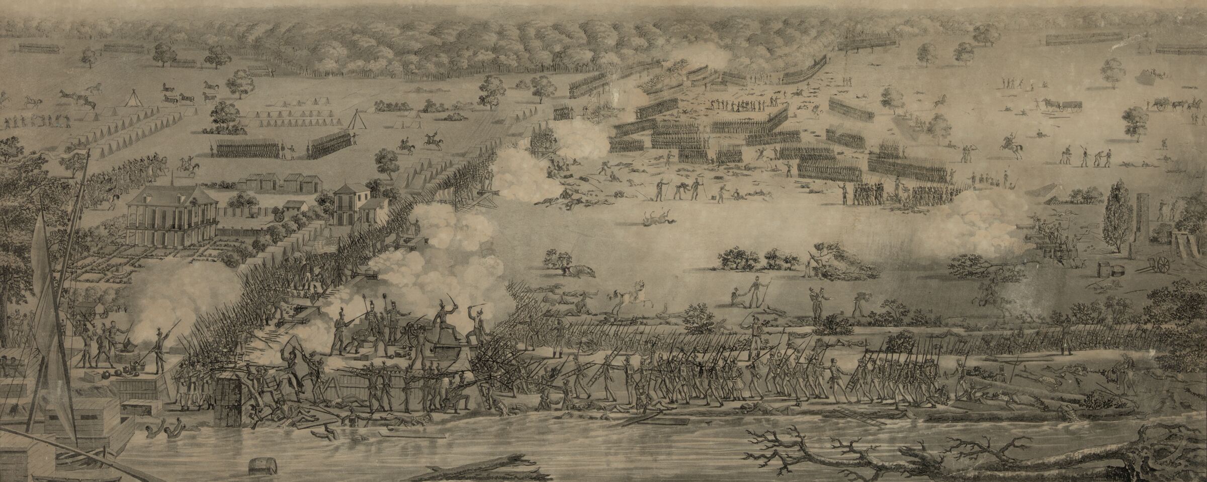
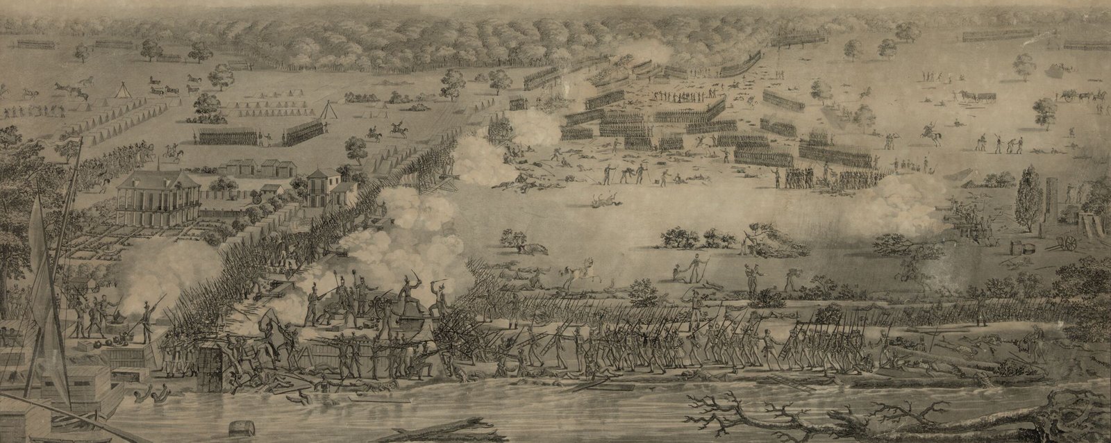
/meetings/2027/battle-of-new-orleans-laclotte.jpg | The Battle of New Orleans, January 8, 1815: British columns crossing the Chalmette plain toward the American line beside the Mississippi. The masthead of the 2027 Annual Meeting page. | The print "Defeat of the British Army, 12,000 strong, under the Command of Sir Edward Packenham", engraved by Philibert-Louis Debucourt after Hyacinthe Laclotte, architect and assistant engineer in the Louisiana army, who drew it on the field of battle in 1815. Library of Congress, Prints and Photographs Division, LC-DIG-pga-01011 (loc.gov/pictures/item/92504355/). Taken from the Library’s master scan on November 18, 2026, cropped to the battlefield (the sky, the margins and the lettering under the picture are left off) and reduced to 2400 px wide; nothing else is altered. | Public domain. The Library of Congress records no known restrictions on publication. |
/meetings/programs/2002.jpg | The cover of the program of the 2002 Annual Meeting: War and Remembrance, Madison, Wisconsin. | The first page of the 2002 program (/docs/ConferencePrograms/2002SMHProgram.pdf), made into a picture 560 px tall on November 18, 2026. | The Society’s own publication. |
/meetings/programs/2010.jpg | The cover of the program of the 2010 Annual Meeting: Causes Lost and Won, Lexington, Virginia. | The first page of the 2010 program (/docs/ConferencePrograms/2010SMHProgram.pdf), made into a picture 560 px tall on November 18, 2026. | The Society’s own publication. |
/meetings/programs/2011.jpg | The cover of the program of the 2011 Annual Meeting: Ways of War, Lisle, Illinois. | The front cover, cut from the scan of the open cover that is the first page of the 2011 program (/docs/ConferencePrograms/2011SMHProgram.pdf), made into a picture 560 px tall on November 18, 2026. | The Society’s own publication. |
/meetings/programs/2012.jpg | The cover of the program of the 2012 Annual Meeting: The Politics of War, Arlington, Virginia. | The first page of the 2012 program (/docs/ConferencePrograms/2012SMHProgram.pdf), made into a picture 560 px tall on November 18, 2026. | The Society’s own publication. |
/meetings/programs/2017.jpg | The cover of the program of the 2017 Annual Meeting: Global War: Historical Perspectives, Jacksonville, Florida. | The first page of the 2017 program (/docs/ConferencePrograms/2017SMHProgram.pdf), made into a picture 560 px tall on November 18, 2026. | The Society’s own publication. |
/meetings/programs/2021.jpg | The cover of the program of the 2021 Annual Meeting: Turning the Tide, Norfolk, Virginia. | The first page of the 2021 program (/docs/ConferencePrograms/2021SMHProgram.pdf), made into a picture 560 px tall on November 18, 2026. | The Society’s own publication. |
/meetings/programs/2022.jpg | The cover of the program of the 2022 Annual Meeting: Fort Worth, Texas. | The first page of the 2022 program (/docs/ConferencePrograms/2022SMHProgram.pdf), made into a picture 560 px tall on November 18, 2026. | The Society’s own publication. |
/meetings/programs/2023.jpg | The cover of the program of the 2023 Annual Meeting: San Diego, California. | The first page of the 2023 program (/docs/ConferencePrograms/2023SMHProgram.pdf), made into a picture 560 px tall on November 18, 2026. | The Society’s own publication. |
Note: Every image file the site ships is listed in src/data/images.ts with where it came from and the right to use it. Where no real image exists yet, use type or solid color and record the asset needed with a one-line brief; never fill the space with stock or a generated picture.
Lives in src/data/images.ts
// src/data/images.ts
'/brand/smh-seal-red.png': { source: '…', rights: 'The Society’s own mark.', shows: 'The seal in red.' },Applies to names, quotations, numbers, dates, members and testimonials. Sample content in the guide is labeled as sample.
Not checked yet. How it could be: Review by eye. Copy on pages comes from the database or a named source; anything else needs a source in a comment.
Do
Recipients drawn from the awards records; a quotation with the speaker and the year.
Don't
"Trusted by 2,000 historians." A photograph of a person who does not exist, with a name.
Note: No made-up members, quotations, statistics, dates or testimonials, anywhere, even as a placeholder. Copy on pages comes from the database or a named source. This guide's component examples use made-up sample content and say so at the top.
<!-- Sample content, not a real award. -->
<AwardCard award={sample} />Applies to every page, component and content file: not as icons, not in headings, not in copy.
Checked automatically. npm test fails if this is broken (src/lib/styleguide/copy.test.ts).
Do
Nominations close October 1.
Don't
Nominations close October 1 🎉
Note: Not as icons, not in headings, not in copy. The site's tone does not allow them, and they render differently on every device.
<h2>Nominations close October 1</h2>Applies to every icon, used only where it helps a reader scan. The only icon today is the search magnifier in the header.
Not checked yet. How it could be: One Icon component holding every icon, and a test that finds an inline svg anywhere else.
Do
The search magnifier in the header, and nothing else until a second icon is needed.
Don't
A different icon above every heading, mixed line weights, some filled and some outlined.
Note: An icon earns its place only where it helps a reader scan, such as the search button. A short word or a number usually does the job better. When there is more than one, they share one stroke weight and one size per context, and live in one component.
<svg aria-hidden="true" viewBox="0 0 20 20" width="16" height="16" fill="none" stroke="currentColor" stroke-width="2" stroke-linecap="round">…</svg>What search engines and answer engines read. The site's own search does not read the pages: it runs on Cloudflare AI Search, which is fed one plain-text document per record from the same data each page is drawn from, so these rules are for Google, Scholar and the rest. See docs/search-plan.md.
Applies to every public page. The home page, section fronts and content pages are in /sitemap-pages.xml; News, Journal, People and Awards records are in their section’s sitemap, each with the date its record last changed. /sitemap.xml indexes them and robots.txt names it. The sitemaps are what search engines read, so a page missing from them is invisible to them.
Checked automatically. npm test fails if this is broken (src/lib/sitemap.test.ts).
Do
Add a new section front to FIXED_PAGES; give a new record type a sitemap entry with its updated date.
Don't
Add a page nothing links to and nothing lists, or hand-write a sitemap.
Note: Four sitemaps, one per kind of source, indexed by /sitemap.xml: the prerendered pages (built with the site), News, the Journal and Awards (each rendered from its records). A record's entry carries the date it last changed, so a search engine refetches only what moved; a page without a date says how often to come back instead. A new page with its own .astro file goes in FIXED_PAGES in src/lib/sitemap.ts, and the test says so until it does.
Lives in src/lib/sitemap.ts
<url><loc>https://militarysociety.org/journal/articles/roman-soldiers/</loc><lastmod>2026-10-08T14:03:09Z</lastmod></url>Applies to every public page. The layout writes the page’s kind (news, article, review, person, issue, award, year, page, list), its section and, where the page is about something dated, that date into the head, so search engines and answer engines can tell a record from the list that names it. The site’s own search labels its results with the same kinds.
Checked automatically. npm test fails if this is broken (src/lib/search/kind.test.ts).
Do
Pass the date of the thing the page is about; add a new record route to pageKind before it ships.
Don't
Write these tags from a page, or let a list page claim to be a record.
Note: BaseLayout writes the kind and the section from the URL (src/lib/search/kind.ts) and the date from the page's date prop, which a post, article, review or issue page passes. Search engines and answer engines read them to tell a record from the list that names it. The site's own search uses the same kinds to label and filter its results, and never holds a list page, because it would match every title it lists. A new kind of page needs a line in pageKind and a label.
Lives in src/lib/search/kind.ts
<meta name="smh_kind" content="article" />
<meta name="smh_section" content="journal" />
<meta name="smh_date" content="2026-07-01T00:00:00.000Z" />Applies to every public page: a title that stands alone in a search result, and a description of one or two sentences, which is the intro unless the page gives a better one. Both come through BaseLayout; a page never writes its own title tag.
Not checked yet. How it could be: Build the site and check every page in dist/ for a title and a meta description, with one of each server-rendered route requested from the preview.
Do
A title that says what the page is on its own; an intro that would make sense under it in a search result.
Don't
"Welcome" as a title, or a page with no intro and no description.
Note: The title goes into the title tag with the Society's name after it, and into the Open Graph title. The description is the intro unless the page passes a better one, as the Journal record pages do with the citation and the start of the abstract. A search result shows exactly these two things, so write them to be read there.
---
import BaseLayout from '../../layouts/BaseLayout.astro';
---

<BaseLayout
  title="Access the Journal"
  intro="How members and libraries reach the full text, and how anyone can buy an article."
/>Applies to every page. Everything a reader came for, the title included, is inside the single main element; the site header, the Journal bar and the footer are outside it. Search engines and answer engines take main as the page’s content and the rest as the site’s furniture.
Not checked yet. How it could be: Render each page and check for exactly one main element, with no heading outside it other than the hidden ones in the site header and footer.
Do
One main element per page, holding the title and everything the page is about.
Don't
A second main for a sidebar, or an article's text in an aside outside main.
Note: BaseLayout puts the title band and the page slot inside main and everything else outside it. Search engines and answer engines take main as the page's content, so a reader should never find a page because of its footer, and what a page puts outside main may not be found at all. Put a new element where a reader would expect to find it: in main if it is the page's content, outside if it is the site's furniture.
Lives in src/layouts/BaseLayout.astro
<a class="skip-link" href="#main">Skip to content</a>
<header>…</header>
<main id="main">
  <h1>…</h1>
  …
</main>
<footer>…</footer>Used on any page. Smallest first.
Near the top of any page below a section's front page, to show where it sits.
A trail that stops at the parent
Note: An item with an address is linked. The last item is the page itself, unlinked, when it has no address, as in the first example. Give it an address when the trail stops at the parent because the page's own title follows right under, as a News post does in the second. Journal pages start the trail with the Journal itself.
Lives in src/components/Crumbs.astro
---
import Crumbs from '../../components/Crumbs.astro';
---

<Crumbs
  items={[{ label: 'Journal', href: '/journal/' }, { label: 'Issue archive', href: '/journal/issues/' }, { label: 'Vol. 90, No. 4, October 2026' }]}
/>

---
import Crumbs from '../../components/Crumbs.astro';
---

<Crumbs
  items={[{ label: 'News', href: '/news/' }, { label: 'Annual meeting', href: '/news/category/annual-meeting/' }]}
/>The one way to put the seal on a page: in the header, the footer, or print material.


Note: Takes a width only and works out the height, and has no class or style props, so the seal cannot be stretched, cropped or recolored. Pass variant='black' for one-color print and decorative when text beside it already names the Society. The page never loads the full-size file: the seal is resized at the edge to the width asked for, with sharper copies for denser screens; in development it gets the original.
Lives in src/components/Logo.astro
---
import Logo from '../../components/Logo.astro';
---

<Logo width={64} />A photograph or archive image shown whole, with its caption under it when it has one: a post's cover, or an image inside a post.

Note: Pass an ImageAsset: imageAsset(row) for an uploaded picture, or the path, size and caption of a file recorded in src/data/images.ts. The caption belongs to the picture: it is shown wherever the picture is used, read to people who cannot see it, and holds the credit when the picture needs one; it may be empty. The browser is offered the image at four widths, resized at the edge by Cloudflare Image Transformations; in development it gets the original. Set loading='eager' only for the one image above the fold; the browser is then asked to fetch it ahead of the page's other pictures.
Lives in src/components/Figure.astro
---
import Figure from '../../components/Figure.astro';
---

<Figure image={imageAsset(media)} />Only on pages that do not have their real content yet.
Placeholder page. Content and components come later.
Note: Temporary. Remove it from a page as soon as the real content arrives; no page should launch with it.
Lives in src/components/PagePlaceholder.astro
---
import PagePlaceholder from '../../components/PagePlaceholder.astro';
---

<PagePlaceholder
  planned={['Hero: the upcoming Annual Meeting', 'Latest news', 'The Journal: current issue']}
/>The top of every page, with the page's H1 and intro: a navy band on section fronts, and on leaf pages the breadcrumbs and title on the page above a navy rule.
How members, libraries and everyone else read the Journal, in print and online.
On a leaf page
How members, libraries and everyone else read the Journal, in print and online.
Note: The page layout draws it from its title and intro and picks the look from the page's depth (one step down from the home page is a section front; anything deeper is a leaf page), so pages rarely use it directly; a page passes its breadcrumbs to the layout and they land above the title, light on the band. Award and Journal pages add facts below the title (authors, issue and pages, deadline) through its header slot; the News pages put the categories and a post's date there, and a News post keeps the band, with its summary as the intro. Nothing goes above the title but the breadcrumbs.
Lives in src/components/PageHeader.astro
---
import PageHeader from '../../components/PageHeader.astro';
---

<PageHeader
  title="Access the Journal"
  intro="How members, libraries and everyone else read the Journal, in print and online."
/>

---
import PageHeader from '../../components/PageHeader.astro';
---

<PageHeader
  title="Access the Journal"
  intro="How members, libraries and everyone else read the Journal, in print and online."
  variant="plain"
  crumbs={[{ label: 'Journal', href: '/journal/' }, { label: 'Access the Journal' }]}
/>The top of the home page or a section front page: one thing the Society wants every visitor to see, on navy or over a photograph.
Four days of panels, tours and the awards banquet. Registration opens in November; early rates run until January 15.
Note: One per page, and only above the fold. The first button is the main action; any after it are secondary. The band is navy, so red stays for buttons and urgent notices. Give it a photograph (image) and the picture sits under a navy shade with its credit in the corner; the file needs a record in src/data/images.ts. Its title is an H2 until the page layout lets the home page use it as the H1 (headingLevel h1). Keep the text to two sentences: it is a banner, not an article. Sample content; the second code sample shows the image option, which waits for a photograph of the Society's own.
Lives in src/components/Hero.astro
---
import Hero from '../../components/Hero.astro';
---

<Hero
  title="The 2027 Annual Meeting"
  text="Four days of panels, tours and the awards banquet. Registration opens in November; early rates run until January 15."
  actions={[{ label: 'Plan your visit', href: '/meetings/annual-meeting/' }, { label: 'Become a member', href: '/membership/' }]}
/>

---
import Hero from '../../components/Hero.astro';
---

<Hero
  image={{ src: '/images/annual-meeting.jpg', alt: 'What the photograph shows', width: 1800, height: 1200, credit: 'Who took it, and where it is kept' }}
  title="The 2027 Annual Meeting"
  text="Four days of panels, tours and the awards banquet. Registration opens in November; early rates run until January 15."
  actions={[{ label: 'Plan your visit', href: '/meetings/annual-meeting/' }, { label: 'Become a member', href: '/membership/' }]}
/>Under the hero on the home page, from the day the coming Annual Meeting's dates are set until its last day: where and when it is, and the next date a reader has to act on.
93rd Annual Meeting
Sheraton New Orleans Hotel
Next date to knowDecember 31, 2026Accepted participants must be members of the Society to be placed on the program
Plan for the meetingWith no dates left but the meeting
93rd Annual Meeting
Sheraton New Orleans Hotel
Note: It takes no content of its own: the meeting, its days and the dates to know are in src/data/meeting.ts, which the Annual Meeting page's masthead and dates to know read too. The next date moves on by itself as each one passes; when only the meeting is left the band keeps the place, the days and the button; after the last day it shows nothing. The button is an outline, because the hero above it already has the page's red one. Use it once per page: its heading has a fixed id. The first example is the band as of December 1, 2026, the second as of March 1, 2027.
Lives in src/components/MeetingBand.astro
---
import MeetingBand from '../../components/MeetingBand.astro';
---

<MeetingBand />The title of the Annual Meeting page while a meeting is ahead: where and when it is, set large as the page's H1, the venue, and the next date a reader has to act on.
Sheraton New Orleans Hotel
Next date to knowDecember 31, 2026Accepted participants must be members of the Society to be placed on the program
The Battle of New Orleans, drawn on the field by Hyacinthe Laclotte, 1815. Library of Congress.
Note: It takes the place of the page title and is the page's one focal point, so the page under it has no second band or picture. The meeting, its days and its dates are in src/data/meeting.ts. So is its picture: archive material in the public domain on the military history of the host city, shown under the navy shade with its credit, recorded in src/data/images.ts and changed with each meeting; with no picture the masthead is navy. The next date moves on by itself each time the site is built, and after the meeting's last day the page route goes back to the plain page title. Nothing but the title goes on the picture: the meeting navigation follows as a bar of its own on the page white. The example is the masthead as of December 1, 2026.
Lives in src/components/MeetingMasthead.astro
---
import MeetingMasthead from '../../components/MeetingMasthead.astro';
---

<MeetingMasthead crumbs={crumbs} />
---
import MeetingNav from '../../components/MeetingNav.astro';
---

<MeetingNav bar />A few numbers that say what the Society is, set very large on navy: on the home page, or a section front with figures worth showing.
Note: Two to four figures, each with a line saying what it counts. Real numbers only, with their source noted in the page that uses it; these are the Society's own, from the About and Donate pages. One figures band per page.
Lives in src/components/Figures.astro
---
import Figures from '../../components/Figures.astro';
---

<Figures
  items={[{ value: '1933', label: 'Founded, as the American Military History Foundation' }, { value: '3,200', label: 'Members: scholars, soldiers and citizens interested in military history' }, { value: '1937', label: 'The Journal published every quarter since, first as Military Affairs' }, { value: '119', label: 'Graduate students brought to the Annual Meeting by Weigley travel grants' }]}
/>
Two things a reader can do next, side by side, at the foot of the home page or a section front: for example join, or give.
Membership includes the printed Journal, full online access through EBSCO, and the Headquarters Gazette.
The Society is a 501(c)(3) non-profit organization. Gifts to its endowment funds are tax deductible as allowed by U.S. law.
Note: Exactly two, the first on navy and the second on the tint, each with one button. Each door is a place a reader goes, so both buttons say where: Join or renew, Choose a fund. It replaces the callout where a page has two next steps of equal weight.
Lives in src/components/Doors.astro
---
import Doors from '../../components/Doors.astro';
---

<Doors
  doors={[{ heading: 'Join the Society', text: 'Membership includes the printed Journal, full online access through EBSCO, and the Headquarters Gazette.', button: { label: 'Join or renew', href: '/membership/' } }, { heading: 'Give to the Society', text: 'The Society is a 501(c)(3) non-profit organization. Gifts to its endowment funds are tax deductible as allowed by U.S. law.', button: { label: 'Choose a fund', href: '/donate/' } }]}
/>The newest News posts with a link to all news, for the home page or any section page.
Live from the database: the newest published posts. If nothing appears below, there are no published posts yet.
Loading the latest posts…
Note: The newest post is set large, as the News front sets its lead: the title in the display face, the summary under it, and the cover above, cropped to 3:2, when it has one; the rest are listed beside it, under a section head with the link to all news. It fetches the posts itself, so it shows real published posts, not sample content, and shows nothing at all when there are none. Most pages are built ahead of time, so keep server:defer: it makes the row load fresh posts on each visit. It has its own H2 (Latest news, or the title prop).
Lives in src/components/LatestNews.astro
---
import LatestNews from '../../components/LatestNews.astro';
---

<LatestNews server:defer count={3} />At the top of every page. The page layout already includes it.
Note: The seal, at 80 px, sits on the white masthead because it is for light backgrounds only, with the Society's name set beside it in the display face at the feature-title size (a step down on phones) until a wordmark exists; together they link home. The utility bar is the deep navy, so red stays for the one call to action and the current section's underline. Both menus are set in src/data/navigation.ts. Between 64rem and 76rem the navigation takes its own row; below 64rem the utility bar is hidden and the Menu button opens a navy panel with the navigation, the join button, the utility links and search (narrow the window to see it). The search field is a plain form to /search/, so it works without JavaScript.
Lives in src/components/SiteHeader.astro
---
import SiteHeader from '../../components/SiteHeader.astro';
---

<SiteHeader />The pieces a News post or a content page is built from. New block types (quote box, button row and so on) will join this group.
Formatted text (headings, lists, quotes, links) written in Markdown.
The Society welcomes nominations for Vice President and Trustees. The Vice President serves two years in that office and then two years as President.
Send the candidate’s name and a short statement to the chair of the committee. You may nominate yourself.
The Society is only as strong as the people who give their time to it.
Read more about the Council and its work.
Note: Pages and News posts normally use it through the block renderer below, not directly. Any HTML typed into the Markdown shows as plain text instead of running, which keeps pasted code harmless. Headings inside start at H2, because the page title is the H1.
Lives in src/components/blocks/TextBlock.astro
---
import TextBlock from '../../components/blocks/TextBlock.astro';
---

<TextBlock block={{ type: 'text', markdown: 'Write **Markdown** here.' }} />A picture inside a post or page, shown whole across the reading column with its caption.
Note: The block stores only the media id; the picture's size and caption come from its media row when the page renders, looked up once for the whole body by loadBlockImages. A block whose image no longer exists renders nothing. In News the editor adds one with the Picture button, from a new upload or a picture already uploaded, and the caption is typed under it.
Lives in src/components/blocks/ImageBlock.astro
---
import ImageBlock from '../../components/blocks/ImageBlock.astro';
---

<ImageBlock
  image={images[block.mediaId]}
  block={{ type: 'image', mediaId: '<media id>' }}
/>A file for readers to download from a post or page, such as a call for applications, a flyer or a program.
Brand one-sheetPDF225 KB
Note: One line: the words that say what the file is, as the link, then the kind of file and its size, so a reader knows what will open. The block stores the file's id and the words of the link; where the file is, its kind and its size come from its files row when the page renders, looked up once for the whole body by loadBlockFiles. With no words the file's own name is the link. Files one after another share their rules, like rows of a documents list. A block whose file no longer exists renders nothing. In News the editor adds one with the File button or a dropped PDF. PDF only for now.
Lives in src/components/blocks/FileBlock.astro
---
import FileBlock from '../../components/blocks/FileBlock.astro';
---

<FileBlock
  file={files[block.fileId]}
  block={{ type: 'file', fileId: '<file id>', label: 'Call for applications' }}
/>Renders a list of blocks, the body of a News post or a content page.
The first block of a post.
More text in the same block.
Text after the picture.
Brand one-sheetPDF225 KB
Note: Three block types today: text, image and file. Pass images, from loadBlockImages, when the blocks may include pictures, and files, from loadBlockFiles, when they may include files. New block types are added here once, and then every page and News post can use them. A block of an unknown type renders nothing.
Lives in src/components/blocks/BlockRenderer.astro
---
import BlockRenderer from '../../components/blocks/BlockRenderer.astro';
---

<BlockRenderer blocks={blocks} images={images} files={files} />What a content page is made of. A content page is a YAML file in src/content/pages/: its path is the URL, and it holds a title, an intro and an ordered list of sections, checked against the schema in src/content.config.ts when the site builds. Smallest first. Examples use the real About page text.
The next steps under a section: one filled button for the main action, outlines for the rest.
Note: Label each button with what happens next: Go to the Journal, never Click here. At most one primary button per section. Links open in the same tab unless the button is marked newWindow, as the last one here is; keep that for a booking or other site a reader will want to come back from.
Lives in src/components/page/ButtonRow.astro
buttons:
  - { label: Join or renew, href: /membership/, style: primary }
  - { label: Give to the Society, href: /donate/ }
- { label: See the hotel, href: 'https://www.marriott.com/en-us/hotels/msyis-sheraton-new-orleans-hotel/overview/', newWindow: true }The opening of a content page, under the page title: what the page is about, in a few sentences, set large on the reading measure.
Founded in 1933 as the American Military History Foundation, renamed the American Military Institute in 1939 and the Society for Military History in 1990, the Society today has more than 3,200 members.
Note: One per page, first, at the head of the centered column. Three or four sentences at most; anything longer belongs in a text section.
Lives in src/components/page/LeadSection.astro
- type: lead
text: Founded in 1933 as the American Military History Foundation …The everyday section: a section heading, text blocks, and optional buttons under them.
The Society is governed by its constitution and led by its officers and trustees, who meet each year to set policy, procedures and strategic direction.
Note: The heading is the section's H2 and should say something. Heading and text share the page's centered column, the same one a News post uses, and the text is set a step larger, as post text is. Leave the heading out only for a page's opening text.
Lives in src/components/page/TextSection.astro
- type: text
  heading: How the Society is governed
  blocks:
    - type: text
      markdown: The Society is governed by its constitution …
  buttons:
- { label: Read the constitution, href: … }Two to six comparable things a reader chooses between, each a card with a title, one line and a button.
The Society’s quarterly, peer-reviewed journal, published since 1937.
Prizes for scholarship and service, and grants for graduate students’ research and travel.
Note: Cards are tiles on the tint with a navy rule on top, for discrete things, never for running text. No icons: the title does the work. Buttons in cards are outlines, so the page keeps one main action. Two to four cards sit side by side; five or six go in rows of three, so a row never ends with one stray card. Live example: the Donate page.
Lives in src/components/page/CardsSection.astro
- type: cards
  heading: What the Society does
  items:
    - title: The Journal of Military History
      text: The Society's quarterly, peer-reviewed journal, published since 1937.
button: { label: Go to the Journal, href: /journal/ }A section front that leads to exactly two things of equal standing, such as the Annual Meeting and the Summer Seminar: each a title, a sentence, a few facts and one button.
The Society’s members work on every era of military history, and the Annual Meeting is where they present their latest research.
The Summer Seminar in Military History is two weeks in residence at the Virginia Military Institute.
Note: The pair is the page's one focal point, and the two halves are equal on purpose: the same parts in the same order, the same terms in the facts, the same filled button, with the rows lined up across the two. Give both halves a fact for every term, and never set one larger, first on navy or with the only picture. Exactly two: three or more comparable things are cards. No label above the titles and no fill, so the navy rule and the type do the work. Live example: Meetings.
Lives in src/components/page/PairSection.astro
- type: pair
  label: The Society's two meetings
  items:
    - title: Annual Meeting
      text: The Society's members work on every era of military history, and the Annual Meeting is where they present their latest research.
      facts:
        - { term: When, detail: 'March 11 to 14, 2027' }
        - { term: Where, detail: 'Sheraton New Orleans Hotel, New Orleans, Louisiana' }
button: { label: Go to the Annual Meeting, href: /meetings/annual-meeting/ }A list of files to download, such as policies, audits or newsletter issues: each a title, a label saying what kind of file it is, and one line on what it holds.
The conduct the Society expects at its meetings, and how to make a complaint.
Note: Use it in place of a page that only wraps one file: the old site had about forty of those. Files carried over from the old site keep their old path under /docs/, so links to them from elsewhere still work. Set compact for a long run of dated files, which drops the lines and sets the titles in columns. Live examples: Governance and policies, and the Headquarters Gazette.
Lives in src/components/page/DocumentsSection.astro
- type: documents
  heading: Policies
  items:
    - title: Code of conduct and complaint process
      href: /docs/Policies/ConductPolicy.pdf
note: The conduct the Society expects at its meetings, and how to make a complaint.Rows of facts that share columns, such as membership or advertising rates, which a reader compares line by line.
| Membership | One year | Two years |
|---|---|---|
| Regular, United States and Canada | $95 | $190 |
| Regular, overseas | $105 | $210 |
Rates are in U.S. dollars.
Note: The first cell of each row names the row. Two to five columns: up to three sit in the page's centered column, four or five run the width of the page, heading and all. On a narrow screen the table scrolls sideways inside its own box. Conditions and exceptions go in the note under it, never in a cell. Live example: the Membership page.
Lives in src/components/page/TableSection.astro
- type: table
  heading: What membership costs
  columns: [Membership, One year, Two years]
  rows:
    - [Regular, United States and Canada, $95, $190]
note: Rates are in U.S. dollars.One to four photographs side by side that a reader needs in order to compare or act, such as how an exhibit table is set up.
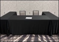
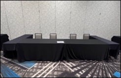
Note: Each file sits in the media bucket and is served under /docs/, never from the repo; say where it came from in a comment at the top of the page's file. Give the file's own width and height: a picture is never shown larger than its file. The caption says what the picture shows and is read to people who cannot see it. The heading is optional, for pictures that follow the section they illustrate. Never for decoration. Live example: Exhibitors and advertisers.
Lives in src/components/page/PicturesSection.astro
- type: pictures
  items:
    - src: /docs/annualmeeting/tabletop-single.jpg
      width: 195
      height: 139
caption: Single tabletopThe people who hold a post or sit on a body, in one or more named groups: officers, trustees by term, the members of each committee.
Note: Rows look the same as the role list on the editorial board page. The names here live in the page file; a body kept in the people records uses the role list instead, which links each name to a profile. Two or more groups sit side by side; one group runs down the page. Live example: the Leadership page.
Lives in src/components/page/RosterSection.astro
- type: roster
  heading: Board of trustees
  groups:
    - title: Terms expiring in 2027
      people:
- { name: Lorien Foote, affiliation: Texas A&M University }Two to four facts a reader came to the page for, such as a rate, a deadline and a place, set large at the top of a page that is otherwise text and tables.
Note: One per page, at the top, where it is the thing worth looking at; the facts are said again in full further down, with their conditions. Keep each fact to a few words so it can be set large, and put conditions in the line under it. No box: a navy rule and the type do the work. At the top of a page it has no heading, so give it a label for screen readers; with a heading it can also set a short list large lower down, as the Annual Meeting page does with the cities of coming meetings. Up to two buttons, for the one thing to do next. Real facts only, taken from the page. Live example: Hotel and travel.
Lives in src/components/page/FactsSection.astro
- type: facts
  label: The hotel, its group rate and when the rate ends
  items:
    - { term: Group rate, detail: $209 a night, note: 'Single or double occupancy, before tax' }
    - { term: Rate ends, detail: 'February 15, 2027', note: Or sooner if the room block fills }
  buttons:
- { label: Reserve a room at the group rate, href: 'https://book.passkey.com/event/51277088/owner/111/landing', style: primary, newWindow: true }On the Annual Meeting page: the coming meeting's dates to know in order, ending with the meeting itself.
Note: The page gives only the heading. The dates are in src/data/meeting.ts, which the home page's meeting band and the masthead read too, so the three cannot disagree; a date with an address there is linked to the page that says more. A passed date is set quieter and says Passed, and the next one is marked Next with a navy rule; both are worked out when the site is built, so they move on with the next build after a date passes. The example is the list as of December 1, 2026.
Lives in src/components/page/MeetingDatesSection.astro
- type: meeting-dates
heading: Dates to know for 2027The covers of the Society's own publications side by side, such as annual meeting programs, each linking to the file it is the cover of.
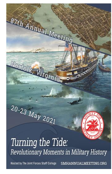
2021
Turning the Tide: Revolutionary Moments in Military History
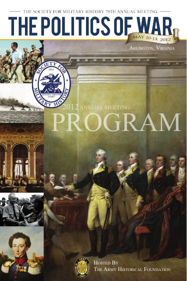
2012
The Politics of War

2010
Causes Lost and Won

2002
War and Remembrance: Constructing the Military Past and Future
Note: Only for a real, designed cover, made from the first page of the file it links to; a document that opens on a page of text is listed without one. Each cover is a file in the repo under public/meetings/ with a record in src/data/images.ts, and sits whole on a tint mat of one shape, so covers of different proportions line up. The label is the year and the title the theme, or the place when the meeting had none. Eight across on a wide screen, four on a tablet, two on a phone. Live example: Past meetings.
Lives in src/components/page/CoversSection.astro
- type: covers
  heading: Eight programs by their covers
  items:
- { src: /meetings/programs/2021.jpg, width: 363, height: 560, label: '2021', title: 'Turning the Tide: Revolutionary Moments in Military History', href: /docs/ConferencePrograms/2021SMHProgram.pdf }A navy panel asking the reader to act, such as joining or giving. One per page at most.
Join or renew your membership, or give to one of the Society’s endowment funds.
Note: Its weight comes from being the only one on the page. Put it near the end, after the reader knows what they are supporting. The main button is red and the rest are white outlines on the navy. Where a page has two next steps of equal weight, use the two doors instead.
Lives in src/components/page/CalloutSection.astro
- type: callout
  heading: Support the Society
  text: Join or renew your membership, or give to one of the Society's endowment funds.
  buttons:
- { label: Join or renew, href: /membership/, style: primary }Renders a content page's sections in order. The page route uses it; pages never call it directly.
The Society for Military History is devoted to stimulating and advancing the study of military history.
Join or renew your membership, or give to one of the Society’s endowment funds.
Note: A new section type is a schema entry in src/content.config.ts, a component in src/components/page/, a case here, and an entry in this group. The body is one centered column; a section whose content needs the room (cards, covers, a wide table, a roster of several groups, a compact list of files) takes the full width, heading and all. The live example is the About page.
Lives in src/components/page/PageSections.astro
---
import PageSections from '../../components/page/PageSections.astro';
---

<PageSections sections={page.data.sections} />The News section: lists, filters and the post page. Smallest first.
Below a list of News posts that runs over more than one page.
Note: Shows nothing when everything fits on one page. Page 1 links to the base address; later pages add ?page=2 and so on.
Lives in src/components/news/NewsPager.astro
---
import NewsPager from '../../components/news/NewsPager.astro';
---

<NewsPager page={2} hasNext base="/news/" />The News front and the category pages: the newest post as the lead, the rest as cards with their date, category and summary.
Twelve graduate students will join this year’s seminar, from programs in the United States, Canada and the United Kingdom.
Early rates run until January 15. Hotel rooms in the conference block are limited, so book soon.
Five articles, a review essay and forty book reviews.
Without a lead
Twelve graduate students will join this year’s seminar, from programs in the United States, Canada and the United Kingdom.
Early rates run until January 15. Hotel rooms in the conference block are limited, so book soon.
Five articles, a review essay and forty book reviews.
Note: Use headingLevel h2 when the list sits directly under the page title, and h3 when it sits under a section heading. The first post is the lead, set large with its photograph 7/12 wide and the title beside it; pass lead={false} on later pages of the list and at the end of a post page, where every post is a card, three across, each under a thin rule with its picture above the title. Pictures are cropped to 3:2 around the faces in them, or their centre when there are none, about 44rem wide for the lead and 24rem for a card. There is no picture here: the only real image in the repo is the seal, which may not be cropped.
Lives in src/components/news/NewsList.astro
---
import NewsList from '../../components/news/NewsList.astro';
---

<NewsList posts={posts} headingLevel="h3" />

---
import NewsList from '../../components/news/NewsList.astro';
---

<NewsList posts={posts} headingLevel="h3" lead={false} />What follows the title band on a News post page: the cover when there is one, the post's text, and three more posts.
The Society welcomes nominations for Vice President and Trustees. The Vice President serves two years in that office and then two years as President.
Send the candidate’s name and a short statement to the chair of the committee. You may nominate yourself.
The Society is only as strong as the people who give their time to it.
Read more about the Council and its work.
The Society welcomes nominations for Vice President and Trustees. The Vice President serves two years in that office and then two years as President.
Send the candidate’s name and a short statement to the chair of the committee. You may nominate yourself.
The Society is only as strong as the people who give their time to it.
Read more about the Council and its work.
Note: The band comes from the page layout with the props from postHeader (src/lib/news/header.ts): the title, the summary as the standfirst, the trail back to News and the post's category, and the date through the header slot; the admin preview sets it the same way. The post comes from the News queries with its cover and the images in its text attached (PostPage). The cover is shown whole, never cropped, no wider than the content and no taller than most of the window, with the post's caption and the image's credit lined up with the text; the same image makes the page's social card. The text sits in a column a step wider than the site's measure, at the larger reading size. A quotation becomes a band across the page, its last paragraph set as the attribution; a picture inside the text keeps to the text's width. Pass more, the newest other posts, for the three cards on the tint band at the end; without them a link back to the list closes the page. Only block types allowed for News are rendered.
Lives in src/components/news/NewsArticle.astro
---
import NewsArticle from '../../components/news/NewsArticle.astro';
---

<NewsArticle post={post} more={more} />The Journal of Military History: articles, reviews and how to read them. Smallest first.
Journal authors or reviewers named inside a sentence, each linked to their page under /people/.
By Tomás Herrera and Daniel Okafor
Note: It prints only the linked names with no wrapper, so put it inside a paragraph or span. Names are joined the way a citation joins them: A and B, or A, B, and C.
Lives in src/components/journal/PersonLinks.astro
---
import PersonLinks from '../../components/journal/PersonLinks.astro';
---

<PersonLinks people={article.authors} />Below any long Journal list that runs over more than one page.
Note: Looks the same as the News pager and shares its styles; only the wording differs (Previous page and Next page), and the label prop names the list for screen readers. Pass pages, the first and last entry on every page, and it lists every page under the two links by the family names it runs between, with the red marker on the page being read, so a reader looking for one name goes straight to its page. The author index and the People index do: listPeople in src/lib/people/queries.ts returns the pages. The list has the id pages, so a line above a long list can link down to it. Without pages, the second example, it shows the two links alone. The two pagers could be merged into one component later.
Lives in src/components/journal/Pager.astro
---
import Pager from '../../components/journal/Pager.astro';
---

<Pager
  pages={pages}
  page={2}
  hasNext
  base="/journal/authors/"
  label="More authors"
/>

---
import Pager from '../../components/journal/Pager.astro';
---

<Pager page={2} hasNext base="/journal/authors/" label="More authors" />A navy block inviting readers to join, beside or below Journal content.
Note: All three props are optional and have sensible defaults; the button always goes to the membership page. It has its own H2, so place it where an H2 makes sense.
Lives in src/components/journal/MembershipCta.astro
---
import MembershipCta from '../../components/journal/MembershipCta.astro';
---

<MembershipCta
  heading="Read every issue since 1937"
  text="Membership includes the printed journal and full online access to the archive."
  button="Join the Society"
/>Under the site header on every Journal page, to brand them as the Journal's and to move between its parts.
Note: The page layout shows it on any address starting /journal/, so pages never add it themselves. Its links are journalNav in src/data/navigation.ts, and the current part is marked from the page address. Set like a printed journal's cover: the name in capitals, centered on the tint, the navigation under it and a navy rule to close. On the Journal front (front, set from the address) the name is the page's H1 at the page title size and the layout leaves the title band out; everywhere else it links to the front. The first example is a page inside the Journal and marks nothing, because the guide is not a Journal page; the second is the front.
Lives in src/components/journal/JournalBar.astro
---
import JournalBar from '../../components/journal/JournalBar.astro';
---

<JournalBar />A list of Journal articles: title, authors and pages, with the abstract and article type if wanted.
Armies on the Western Front ate, fired and moved by rail. This article follows the ration trains of one British corps through the winter of 1916 and shows how timetables drawn up behind the lines decided what reached the trenches. It argues that logistics staff, not commanders, set the pace of the fighting that winter.
Note: Switch parts on as needed: showAbstract for issue pages, showIssue for lists that mix issues (profile pages, prizes), showKind to label anything that is not a plain article. Prize wins show automatically.
Lives in src/components/journal/ArticleList.astro
---
import ArticleList from '../../components/journal/ArticleList.astro';
---

<ArticleList articles={articles} showAbstract showKind />A list of book and media reviews from the Journal.
Note: Titles are set in italics as cited works. Add showIssue when the list mixes issues; set showReviewer to false on a reviewer's own page.
Lives in src/components/journal/ReviewList.astro
---
import ReviewList from '../../components/journal/ReviewList.astro';
---

<ReviewList reviews={reviews} />On an article page: a formatted citation with copy and download buttons.
Margaret A. Ellison, “Supplying the Line: Railways and Rations on the Western Front, 1916–1918,” The Journal of Military History 90, no. 4 (October 2026): 921–954.
Note: Use it once per page: its parts have fixed ids. The Copy button needs JavaScript and a secure page (https, or localhost when testing). RIS and BibTeX download files for reference managers.
Lives in src/components/journal/CiteBlock.astro
---
import CiteBlock from '../../components/journal/CiteBlock.astro';
---

<CiteBlock article={article} issue={article.issue} />On every Journal article page, so Google Scholar can index the article.
Nothing to see on the page: this puts tags in the page head. Open the code to see its real output, rendered from the component.
Note: Place it in the page head with slot="head", as the article page does. Scholar ignores an article without a title, first author and publication date. This guide shows the tags as code and does not add them to this page.
Lives in src/components/journal/ScholarMeta.astro
---
import ScholarMeta from '../../components/journal/ScholarMeta.astro';
---

<ScholarMeta
  article={article}
  issue={article.issue}
  slot="head"
  awards={['Vandervort Prize 2026']}
/><meta name="citation_title" content="Supplying the Line: Railways and Rations on the Western Front, 1916–1918">
<meta name="citation_author" content="Ellison, Margaret A.">
<meta name="citation_publication_date" content="2026/10">
<meta name="citation_journal_title" content="The Journal of Military History">
<meta name="citation_publisher" content="Society for Military History">
<meta name="citation_issn" content="0899-3718">
<meta name="citation_volume" content="90">
<meta name="citation_issue" content="4">
<meta name="citation_firstpage" content="921">
<meta name="citation_lastpage" content="954">
<meta name="citation_abstract_html_url" content="https://militarysociety.org/journal/articles/supplying-the-line/">
<meta name="citation_fulltext_html_url" content="https://openurl.ebsco.com/openurl?issn=0899-3718&volume=90&issue=4&spage=921">
<meta name="citation_language" content="en">
<script type="application/ld+json">{"@context":"https://schema.org","@type":"ScholarlyArticle","headline":"Supplying the Line: Railways and Rations on the Western Front, 1916–1918","name":"Supplying the Line: Railways and Rations on the Western Front, 1916–1918","url":"https://militarysociety.org/journal/articles/supplying-the-line/","mainEntityOfPage":"https://militarysociety.org/journal/articles/supplying-the-line/","author":[{"@type":"Person","name":"Margaret A. Ellison","url":"https://militarysociety.org/people/margaret-a-ellison/"}],"datePublished":"2026-10","abstract":"Armies on the Western Front ate, fired and moved by rail. This article follows the ration trains of one British corps through the winter of 1916 and shows how timetables drawn up behind the lines decided what reached the trenches. It argues that logistics staff, not commanders, set the pace of the fighting that winter.","pageStart":"921","pageEnd":"954","award":["Vandervort Prize 2026"],"isAccessibleForFree":false,"isPartOf":{"@type":"PublicationIssue","issueNumber":"4","datePublished":"2026-10","isPartOf":{"@type":"PublicationVolume","volumeNumber":"90","isPartOf":{"@type":"Periodical","name":"The Journal of Military History","issn":"0899-3718","publisher":{"@type":"Organization","name":"Society for Military History","url":"https://militarysociety.org/"}}}}}</script>On article and review pages: the four ways to reach the full text.
Use the access code from this quarter's member email. Every issue since 1937 is online, with no embargo.
Lost your code? Email jmhsmh@vmi.edu or sign in at the EBSCOhost member login.
A PDF sent by email from the Journal office during business hours, $10.
Full text is in EBSCO's America: History and Life with Full Text and Historical Abstracts with Full Text, and through EBSCO Discovery.
Membership includes the printed journal and full online access to the archive.
Note: Four tiles on the tint, the members' door in navy. Use it once per page: its heading has a fixed id. Set what to review on review pages. The EBSCO links and the Journal office email are set in src/lib/journal/format.ts, not here.
Lives in src/components/journal/AccessBlock.astro
---
import AccessBlock from '../../components/journal/AccessBlock.astro';
---

<AccessBlock issue={article.issue} item={article} what="article" />One page per person, under /people/, shared by the Journal, Awards and News. These show a person where they are named. Smallest first.
Who a News post is by, beside the date in the post's header, when a person rather than the Society is its author.
Note: Shown only when the post names a person; most posts are the Society's own voice and carry no byline. The name links to the person's page with rel=author.
Lives in src/components/people/Byline.astro
---
import Byline from '../../components/people/Byline.astro';
---

<Byline person={byline} />The people on one of the Society's bodies: the Journal's advisory board or staff, and later officers, trustees and committees.
Note: Each seat is the person linked, their title on the body if any, their affiliation, and the term where the body keeps terms (termed in src/lib/people/roles.ts). A year that is not known is left out, never guessed.
Lives in src/components/people/RoleList.astro
---
import RoleList from '../../components/people/RoleList.astro';
---

<RoleList body={body} seats={seats} />
Awards and grants: deadlines, cards, recipients and the award pages. Smallest first.
One short phrase saying where an award's competition stands.
Note: It works out the state from the award's dates and today's date, so leave out the now prop on real pages. This guide passes a fixed date so every state shows. The chip switches to the accent color in the last 60 days before a deadline, and counts down the days in the last 14.
Lives in src/components/awards/DeadlineChip.astro
---
import DeadlineChip from '../../components/awards/DeadlineChip.astro';
---

<DeadlineChip award={award} />A highlighted list of awards currently taking applications, nearest deadline first.
Note: Shows nothing when no competition is open. Add soonOnly to list only deadlines in the next 60 days, for example on the home page. Use it once per page: its heading has a fixed id.
Lives in src/components/awards/ClosingSoon.astro
---
import ClosingSoon from '../../components/awards/ClosingSoon.astro';
---

<ClosingSoon awards={awards} />One award on the awards index, a tile led by the amount: amount, name, one-line summary, latest recipients and the deadline state.
$200 per article
Outstanding journal articles in military history, in the Journal and beyond it.
Closes Jan 10, 2027
An annual lecture at the American Historical Association meeting, printed in the Journal.
By invitation
Note: The amount is the biggest thing on the tile because it says the most; an award with no amount starts with its name. Each card is a list item, so cards must sit inside a list with the award-cards class, which also lays them out in a grid. It names at most two recent recipients, then and 1 more.
Lives in src/components/awards/AwardCard.astro
---
import AwardCard from '../../components/awards/AwardCard.astro';
---

<ul class="award-cards">
  <AwardCard award={award} latest={latest} now={now} />
</ul>The people who received an award, with their tier, work and affiliation.
Margaret A. Ellison, Sample State University
Supplying the Line: Railways and Rations on the Western Front · Journal of Military History 90, no. 4
Honorable mentionFirst BookTomás Herrera
Garrison Towns · Sample University Press, 2025
Shared with a second honorable mention in the same category.
Note: A winner has no tag; other tiers (honorable mention, runner-up, finalist, commendation) and book categories show as small tags. Names that match a person with a page are linked automatically.
Lives in src/components/awards/RecipientList.astro
---
import RecipientList from '../../components/awards/RecipientList.astro';
---

<RecipientList rows={rows} />The whole page for one award. Used by /awards/ followed by the award's name.
Note: It renders a complete page, header and footer included, so it is shown here as a real page in a frame: /awards/vandervort-prize/. Its copy comes from the award's file in src/content/awards/.
Lives in src/components/awards/AwardPage.astro
---
import AwardPage from '../../components/awards/AwardPage.astro';
---

<AwardPage award={award} rows={rows} awards={awards} now={now} />The whole page listing everything awarded in one year. Used by /awards/ followed by a year.
Note: A complete page, shown in a frame: /awards/2026/. A year with no recipients in the database is a Page not found, so on a fresh local setup load the recipients first (see the README).
Lives in src/components/awards/YearPage.astro
---
import YearPage from '../../components/awards/YearPage.astro';
---

<YearPage year={year} rows={rows} awards={awards} years={years} />The results page at /search/: the field, the row that narrows by section, and the list. Smallest first. The header's own search field is part of the site header above. Results come from the AI Search instance through src/lib/search/, which also sends it the documents it searches; see docs/search-plan.md.
In the title band of the results page: the query as typed and one button. A plain GET form, so every search has an address and none needs JavaScript.
News, the Journal’s articles, reviews and authors, awards and grants, and the Society’s pages.
Note: Pass the current query so the field keeps it, and the section so narrowing survives a new query; leave both out on the empty page. The field is capped at 100 characters, the same cap the page applies, and takes focus when there is no query yet.
Lives in src/components/search/SearchForm.astro
---
import SearchForm from '../../components/search/SearchForm.astro';
---

<SearchForm q="roman army" section="journal" />Under the field once there is a query, to narrow results to one part of the site: everything, the Journal, News, awards and grants, or the Society's own pages.
Note: Links, not buttons: each narrowing is a page with its own address, so it can be shared and cached. Set exactly as the News categories are, because it does the same job; the two share one block of styles. The sections and their labels are SEARCH_SECTIONS in src/lib/search/query.ts.
Lives in src/components/search/SearchFilters.astro
---
import SearchFilters from '../../components/search/SearchFilters.astro';
---

<SearchFilters q="roman army" current="journal" />The results page: one ranked list of pages, best match first, each labeled with what it is.
Journal article
The question turns on pay, length of service and the state’s part in supplying the legions, which the sources let us follow from the Punic Wars onward.
News
Twelve graduate students will join this year’s seminar, from programs in the United States, Canada and the United Kingdom.
Award
For the best article on military history published in the Journal in the preceding year.
Note: Not grouped by section: a reader sees the best match first whatever part of the site it is from, and the label says which. The label is the page's kind from src/lib/search/kind.ts, the passage is the best-matching chunk cleaned of Markdown and cut at a word, and the date is a month for Journal records and a day for anything else. One call returns at most 50 passages, so a query yields roughly 20 to 30 pages and the filters narrow rather than a pager.
Lives in src/components/search/SearchResults.astro
---
import SearchResults from '../../components/search/SearchResults.astro';
---

<SearchResults results={results} results="results" />The public page of a survey the office writes in the admin, at /surveys/ and the survey's address: the words at the top, then the form. The page itself is src/pages/surveys/[slug]/index.astro, which checks every answer with src/lib/surveys/answers.ts and shows the form again with a note under anything refused.
On a survey's page while it is open: the person's name and address when the survey asks for them, each required or optional as the office set it, then each question in order as a plain form control, with a heading and text between them where the office put one, and one button.
Note: Six kinds of question: short and long answers, choose one, choose any that apply, pick from a list, and a rating from 1 to 5 or 10, with an Other line where the office allows one. Choose any that apply with a single option is one box to tick: required, it is a statement the person must agree to (question 7 here). A section is a heading and its text between questions (The session rooms here); it asks nothing, takes Markdown with raw HTML off, and the question numbers skip it. Help under a question keeps its paragraphs. Field names come from the question ids (fieldName in src/lib/surveys/answers.ts), so a reworded question keeps its answers. Optional questions say so after their words, as do the name and the address when nameRequired or emailRequired is false (shown here on the name; both default to required); nothing is starred. A field people never see catches bots; it is hidden from readers and from assistive technology alike. Works without JavaScript: errors come back from the server and sit under their questions.
Lives in src/components/surveys/SurveyForm.astro
---
import SurveyForm from '../../components/surveys/SurveyForm.astro';
---

<SurveyForm
  questions={questions}
  errors={errors}
  values={values}
  action="/surveys/annual-meeting-2027/"
  askName
  nameRequired={false}
  askEmail
/>The page shell, spacing, and the few classes meant for use anywhere. Classes starting journal-, award- or news- belong to those sections' components; do not reuse them elsewhere.
Every public page. It adds the header, the title band with the page's H1, and the footer.
Note: Shown in a frame using the real About page. Pass crumbs and they land above the title; the title's look follows the page's depth (a navy band one step down from the home page, plain deeper) unless headerVariant says otherwise; pass header={false} when the page carries its own H1, as the home page does with its hero. Add noindex for pages that should stay out of search results. Pass image, made with socialCard() from a post's cover, and the page gets og:image and Twitter card tags for the picture shown when it is shared. It also adds the skip link (the skip-link class), which appears only when someone presses Tab, for keyboard users to jump past the menus.
Lives in src/layouts/BaseLayout.astro
---
import BaseLayout from '../../layouts/BaseLayout.astro';
---

<BaseLayout
  title="About the Society"
  intro="One or two sentences under the title."
>
  <section class="container">…</section>
</BaseLayout>Seven steps for every margin, padding and gap.
--space-1 · 0.25rem · 4px · Tight gaps: between a label and its value--space-2 · 0.5rem · 8px · Small gaps: inside chips, between list items--space-3 · 1rem · 16px · Default gap: card padding, paragraph spacing--space-4 · 1.5rem · 24px · Between blocks within a section--space-5 · 2.5rem · 40px · Between parts of a section--space-6 · 4rem · 64px · Large breaks: above the footer, page bottom padding--space-section · clamp(3.5rem, 7vw, 5.5rem) · · Above and below each band or section of a pageLives in src/styles/tokens.css
gap: var(--space-1); /* 4px */
gap: var(--space-2); /* 8px */
gap: var(--space-3); /* 16px */
gap: var(--space-4); /* 24px */
gap: var(--space-5); /* 40px */
gap: var(--space-6); /* 64px */
gap: var(--space-section); /* */Tokens that set how wide content gets and the space at the edges. Any other token lands here too.
| Token | Value | Used for |
|---|---|---|
--content-width | 76rem (1216px) | Widest the page content gets |
--measure | 36rem (576px) | Widest a column of reading text gets: about 72 characters of body text, inside the 60 to 75 that read comfortably |
--measure-wide | 44rem (704px) | A News post's text column: a step wider than the measure, at the larger reading size (text-lg); about 77 characters a line |
--gutter | 1.25rem (20px) | Space at the left and right edges of the page |
Lives in src/styles/tokens.css
var(--content-width) /* 76rem */
var(--measure) /* 36rem */
var(--measure-wide) /* 44rem */
var(--gutter) /* 1.25rem */Wrap page content in it to center it at the site's width, with space at the edges.
Content inside a container never gets wider than the content width token.
Note: The dashed outline is drawn by this guide only, to show the edges. Most components that fill a page, such as the latest news row, already include it.
<div class="container">
<p>Content inside a container never gets wider than the content width token.</p>
</div>The H2 that opens each section of a page, such as Prizes for scholarship on the Awards page.
For books, articles and public history, and for a career’s work in the field.
Note: A navy rule under the heading marks where a section starts, so a long page reads as parts rather than one wall. The heading is set in capitals by the stylesheet. Where a section has a page of its own, use a section head row (section-head) and put the link to it at the right end of the rule. The Journal and Awards sections use the same style through their own class names; new pages use section-heading.
<section>
<h2 class="section-heading">Prizes for scholarship</h2>
<p>For books, articles and public history, and for a career’s work in the field.</p>
</section>
<div class="section-head">
<h2>News from the Society</h2>
<a href="/news/">All news</a>
</div>Small capitals in the display face beside or above a thing, saying what it is: a date and category under a title, a side block's heading, a chip.
Open now
Note: Always muted, never red, so it names the thing without competing with it. Never above a title as an eyebrow. Keep it to a few words. The Journal and Awards sections use the same style through their own class names; new pages use label.
<p class="label">Open now</p>Square buttons in sentence case: the main action in an area (btn), a quieter outline (btn-secondary), or a compact one (btn-small).
Note: Use a link (a) when the button goes to another page and a button element when it does something on this page. One main button per area; make the rest secondary. On navy, in the hero, a band or a door, the outline turns white.
<p>
<a class="btn" href="/membership/">Join the Society</a>
<a class="btn btn-secondary" href="/journal/access/">Access the Journal</a>
<button type="button" class="btn btn-secondary btn-small">Copy</button>
</p>Every rule for the site, from src/data/rules.ts. 22 of 46 are checked automatically: npm test fails when one is broken. The rest are reference for now, each with how it could become a check. Making one a guardrail means writing that test and marking the rule as checked.
| Rule | Applies to | Checked automatically |
|---|---|---|
| Put the logo on light backgrounds only | Every use of the logo, on the site and in print. | Not yet. Place the logo only through a Logo component that accepts the page and tint backgrounds and nothing else. |
| Never stretch, recolor or crop the logo | Every use of the logo. Its color is set once, from the brand red, by scripts/brand/clear-seal.ts; nothing else changes it. | Not yet. The same Logo component, with the seal’s proportions fixed, and a test that finds logo images used any other way. |
| One red: the seal and the site share it | Every red, on the site and in print. The brand red (#990000) is the seal’s ink and the site’s color for action and urgency. The old bright red (#FF0000) is retired and appears nowhere. | Yes, by one-red.test.ts |
| Colors, sizes and spacing come from tokens | Every style rule and component. | Not yet. A test that finds hex colors, raw font sizes and pixel gaps in stylesheets outside tokens.css. |
| The brand direction is written down | DIRECTION in src/data/brand.ts: the tone, the sites admired and what to take from them, and what to avoid. Ask before designing anything if it is empty. | Yes, by brand.test.ts |
| Two colors: navy for structure, red for action | Every use of color. Besides the neutrals there are two colors. The navy is the structural color: the utility bar and footer, the hero and title bands, the figures band, headings, rules and chips. The brand red is for action and urgency only: the seal, buttons, the current section in the navigation, and urgent states such as a deadline closing soon. Red covers no more than about a tenth of any page and never decorates; nothing else is colored. | Not yet. A test that the brand red appears only in the seal, button, current-navigation and urgent-state styles in site.css. |
| Neutrals have a temperature: cool, to sit with the navy | Ink, muted, surface, surface-alt and border. Each leans slightly blue, so the page, the tint and the text belong with the navy; none is a pure gray. | Yes, by design.test.ts |
| Every font has a stated reason | Each font in src/data/brand.ts: what it is for and why it was chosen, not only where it comes from. | Yes, by brand.test.ts |
| Rule | Applies to | Checked automatically |
|---|---|---|
| One H1 per page | Every page. | Not yet. Check every built page has exactly one H1. Skip /styleguide/: its examples of the page title band are real H1s. |
| Every heading uses the type scale | Every heading on every page. | Not yet. Give H1 to H3 site-wide styles from the type scale, then a test that finds headings sized any other way. |
| Sentence case in the writing; capitals only where the design sets them | Headings, buttons, labels and link text are written in sentence case. The stylesheet sets some of them in capitals: the utility bar, the main navigation, section headings (H2), labels, chips and the footer’s group headings. Nothing else is capitalized, and nothing is ever typed in capitals. | Not yet. Hard to check by machine because of proper names; review by eye. A test could find words typed in capitals in pages and content files. |
| Reading text runs no wider than about 70 characters | Paragraphs, abstracts, descriptions and any other text meant to be read line by line. | Not yet. Make the measure a token (prose containers cap at 44rem today) and check every prose container uses it. |
| Rule | Applies to | Checked automatically |
|---|---|---|
| No em dashes | All copy: headings, body text, buttons, captions. | Yes, by copy.test.ts |
| Link text says where it goes | Every link and button. | Yes, by copy.test.ts |
| Every image has alt text | Every image. | Not yet. Check built pages for images with no alt attribute. |
| American spelling | All copy. | Not yet. Check copy against a list of common British spellings. |
| Dates read January 10, 2027 | Every date in copy. | Not yet. Check copy for dates written other ways, such as 10/01/2027 or 10 January 2027. |
| No marketing words | Copy written into pages, components, navigation and content files. Society text held in the database is the Society’s own writing. | Yes, by copy.test.ts |
| Buttons say what happens next | Every button and call-to-action link. | Yes, by copy.test.ts |
| Headings say something, not what category they are | Every heading on every page. | Not yet. Hard to check by machine; review each new page by eye against the examples in the guide. |
| Write in the Society’s voice | All copy. Plain, specific and scholarly, as the direction in src/data/brand.ts says; never startup-cheerful. | Not yet. Review by eye against DIRECTION.tone. The marketing-words test catches the worst of it. |
| Rule | Applies to | Checked automatically |
|---|---|---|
| One focal point per page | Every page: one thing set larger, wider or with the only image, and the rest arranged around it. | Not yet. Review by eye when a page is built. Screenshots of every page at phone and desktop widths in the guide would make this quick. |
| Boxes are for discrete, comparable things | Borders, tinted panels and cards. An award, an article or an issue can sit in one; running text, headings and lists sit on the page with spacing and rules doing the work. | Not yet. Review by eye. A count of bordered boxes per built page, shown in the guide, would flag pages that drift. |
| No decoration that does no work | Every stylesheet and component: no gradients, blurred shapes, frosted panels or drop shadows. A solid, translucent navy shade over a photograph, which keeps the type on it readable, is work, not decoration. | Yes, by design.test.ts |
| Corners use one radius | Every rounded corner: one small radius for boxes and buttons, fully round for chips, nothing in between. | Not yet. Make the two radii tokens (4px and 999px are typed by hand in site.css today); the tokens-only test then covers them. |
| No grids of icon, heading and blurb | Any section listing features, benefits or services. Group things by what the reader is trying to do, and give the one that matters most the most space. | Not yet. Review by eye. A test could flag three or more sibling elements that each hold an svg, a heading and one paragraph. |
| Every section earns its place | Every page. A section exists because the content needs it, never because a template had one. Prefer removing to adding. | Not yet. Review by eye: for each section, say what a reader does with it. If nothing, cut it. |
| Motion only shows a change of state | Every stylesheet and component: hover changes color, underline or border only; no scroll-reveal; any animation respects reduced motion. | Yes, by design.test.ts |
| The same thing looks the same everywhere | Eyebrow labels, side blocks, section headings, chips, buttons and every other repeated element, across News, Journal and Awards. | Not yet. A test that finds rules in site.css with identical declarations under different names. The Journal and Awards labels and section headings now share one rule each, so it would pass for those. |
| Every page says where it is | Every page below a section front: breadcrumbs near the top, and the main navigation marking the current section. | Not yet. Check built pages below a section front for breadcrumbs and an aria-current item in the main navigation. |
| Rule | Applies to | Checked automatically |
|---|---|---|
| Real assets only | Every image file the site ships: the Society’s own photographs, archive material and marks, each recorded with its source and rights in src/data/images.ts. Never stock, generated or placeholder imagery. | Yes, by images.test.ts |
| Nothing invented | Names, quotations, numbers, dates, members and testimonials. Sample content in the guide is labeled as sample. | Not yet. Review by eye. Copy on pages comes from the database or a named source; anything else needs a source in a comment. |
| No emoji | Every page, component and content file: not as icons, not in headings, not in copy. | Yes, by copy.test.ts |
| One icon set, one weight, one size per context | Every icon, used only where it helps a reader scan. The only icon today is the search magnifier in the header. | Not yet. One Icon component holding every icon, and a test that finds an inline svg anywhere else. |
| Rule | Applies to | Checked automatically |
|---|---|---|
| Every public page is in a sitemap | Every public page. The home page, section fronts and content pages are in /sitemap-pages.xml; News, Journal, People and Awards records are in their section’s sitemap, each with the date its record last changed. /sitemap.xml indexes them and robots.txt names it. The sitemaps are what search engines read, so a page missing from them is invisible to them. | Yes, by src/lib/sitemap.test.ts |
| Every page says what kind of thing it is | Every public page. The layout writes the page’s kind (news, article, review, person, issue, award, year, page, list), its section and, where the page is about something dated, that date into the head, so search engines and answer engines can tell a record from the list that names it. The site’s own search labels its results with the same kinds. | Yes, by src/lib/search/kind.test.ts |
| Every page has a title and a description | Every public page: a title that stands alone in a search result, and a description of one or two sentences, which is the intro unless the page gives a better one. Both come through BaseLayout; a page never writes its own title tag. | Not yet. Build the site and check every page in dist/ for a title and a meta description, with one of each server-rendered route requested from the preview. |
| The content lives in the one main element | Every page. Everything a reader came for, the title included, is inside the single main element; the site header, the Journal bar and the footer are outside it. Search engines and answer engines take main as the page’s content and the rest as the site’s furniture. | Not yet. Render each page and check for exactly one main element, with no heading outside it other than the hidden ones in the site header and footer. |
| Rule | Applies to | Checked automatically |
|---|---|---|
| Every component has a style guide entry | Every file in src/components/. | Yes, by coverage.test.ts |
| Every token says what it is for | Every token in tokens.css. | Yes, by tokens.test.ts |
| Colors are written as hex | Every color token, so contrast can be measured. | Yes, by tokens.test.ts |
| tokens.css says where the brand stands | The Status line at the top of tokens.css. | Yes, by tokens.test.ts |
| Every color and font is in the brand file | Every color and font token, which needs an entry in src/data/brand.ts. | Yes, by brand.test.ts |
| The type hierarchy points at real styles | Each level in the type hierarchy, which must exist in site.css. | Yes, by brand.test.ts |
| Brand fonts and stylesheets load in one place | src/layouts/SiteAssets.astro, shared by the site and the guide. | Yes, by assets.test.ts |
| Every rule appears in the style guide | Every rule in this list. | Yes, by rules.test.ts |
Every file in src/components/, checked when the page is built: 55 shown above, 2 shown as a real page in a frame, 20 left out on purpose, 0 missing. The test suite (npm test) fails if a component is added without an entry here.
| Component | In this guide |
|---|---|
Crumbs.astro | Shown above |
Doors.astro | Shown above |
Figure.astro | Shown above |
Figures.astro | Shown above |
Hero.astro | Shown above |
LatestNews.astro | Shown above |
Logo.astro | Shown above |
MeetingBand.astro | Shown above |
MeetingMasthead.astro | Shown above |
MeetingNav.astro | Shown above |
PageHeader.astro | Shown above |
PagePlaceholder.astro | Shown above |
SiteFooter.astro | Shown above |
SiteHeader.astro | Shown above |
awards/ | Shown above |
awards/ | Shown in a frame. A whole page (it includes the header and footer), so it is shown as a real award page in a frame. |
awards/ | Shown above |
awards/ | Shown above |
awards/ | Shown above |
awards/ | Shown in a frame. A whole page (it includes the header and footer), so it is shown as a real year page in a frame. |
blocks/ | Shown above |
blocks/ | Shown above |
blocks/ | Shown above |
blocks/ | Shown above |
journal/ | Shown above |
journal/ | Shown above |
journal/ | Shown above |
journal/ | Shown above |
journal/ | Shown above |
journal/ | Shown above |
journal/ | Shown above |
journal/ | Shown above |
journal/ | Shown above |
news/ | Shown above |
news/ | Shown above |
news/ | Shown above |
news/ | Shown above |
page/ | Shown above |
page/ | Shown above |
page/ | Shown above |
page/ | Shown above |
page/ | Shown above |
page/ | Shown above |
page/ | Shown above |
page/ | Shown above |
page/ | Shown above |
page/ | Shown above |
page/ | Shown above |
page/ | Shown above |
page/ | Shown above |
page/ | Shown above |
people/ | Shown above |
people/ | Shown above |
search/ | Shown above |
search/ | Shown above |
search/ | Shown above |
surveys/ | Shown above |
admin/ (20 files) | Left out. Staff-only screens for the admin area. They use their own stylesheet (admin.css), many need a signed-in user and database records, and they are not used to build public pages.The 20 files
|